Case · Replatforming · Legaltech
Breadth
without the maze.
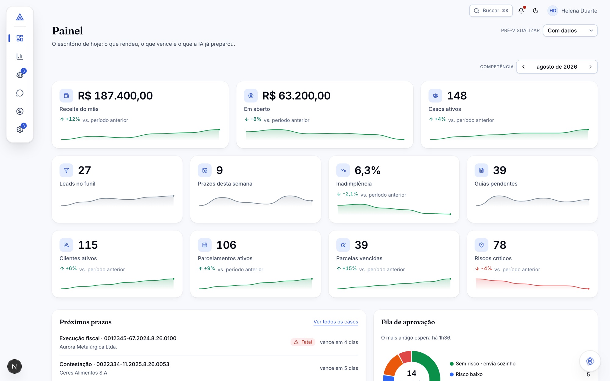
A full-service law firm had 87 screens and 53 menu items — and a quarter of the platform could not be reached from anywhere in the interface. The proposal fits the same capability into roughly 40 screens and 29 items, without removing a single feature.
01 · Context
An all-in-one product nobody could get across.
The platform did everything a firm needs. The problem was never what was missing — it was finding it.
LegalDock is the management platform of Plaça Advocacia: cases, deadlines, clients, documents, sales pipeline, finance, WhatsApp support and a portal of its own for the people being served. Breadth is the product's commercial argument, and it is real. The diagnosis that started this work, however, measured its cost: 87 screens, 53 menu items, 21 routes that existed in the code and appeared nowhere in the menu, and four buttons that opened a blank screen with no error and no warning.
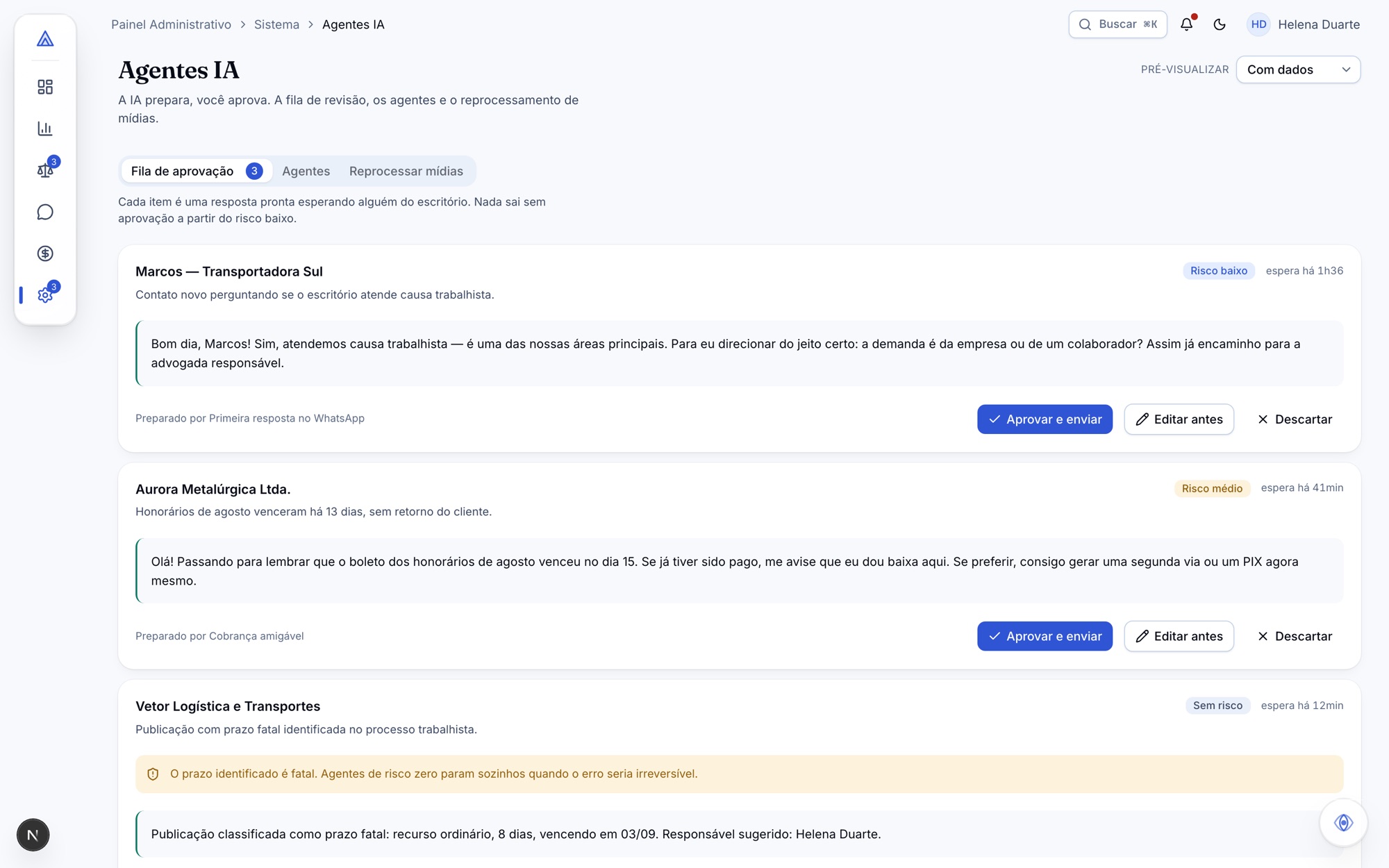
There was also an asset that had been built and made invisible. The human-in-the-loop AI cycle — a queue by risk level, versioned agents, cost per run — was already implemented across six screens, all of them inside the system's administration area. None of them reached the lawyer as product. It was the platform's value promise living at a maintenance address.
02 · Challenge
"All-in-one" and "simple" pull in opposite directions.
The question that organises the whole project: how do you keep the breadth and shrink the surface? Five structural problems accounted for almost all of the confusion that was measured.
A quarter was invisible
21 routes existed in the code with no entry in the menu. Anyone who did not know the URL never got there — and anyone who did could not tell whether it was product or draft.
Two finance systems, one base
20 finance screens, with two competing systems reading the same data and six different places reporting cost. Half of the area was unreachable.
Three WhatsApps, one inbox
Three conversation interfaces, three message bubbles and three text composers for the same task — plus three more hidden in development routes.
Three names for one object
Proceedings, Matters and Cases were the same real-world thing, on different screens and with different data. Clients appeared as Client 360, Clients and Asaas Clients.
States that teach distrust
The AI-generated brief said only "could not generate", with no reason and no action. "New client" opened a blank screen — the worst possible state, because it looks neither like an error nor like success.
No design system
Six upload components, six finance tables with near-identical columns, two notification bells and no shared date picker — forms used the browser's native field, which changes appearance and language with the operating system.
03 · Strategy and mapping
Consolidate before designing.
Before any new screen, the work was product work: measure the redundancy, decide the fate of every orphan route, and regroup the navigation around jobs instead of modules. The table below is the target that guided everything that followed.
| Diagnosis | Proposal | |
|---|---|---|
| Screens | 87 | ~40 |
| Menu items | 53 | 29 · 21 panel + 8 portal |
| Routes outside the menu | 21 | 0 |
| Finance screens | 20 | 7 |
| WhatsApp interfaces | 3 (+3 hidden) | 1 |
| Screens listing clients | 6 | 2 |
| Places reporting cost | 6 | 1 |
| Upload components | 6 | 1 |
| Buttons leading nowhere | 4 | 0 |
The order of attack came from the ratio between effort and impact, and started with what required no strategic decision: fixing the four broken paths, protecting the development routes and unifying the vocabulary are corrections, not choices. The expensive decisions — consolidating finance, picking one WhatsApp interface, unifying the concept of client — came afterwards, each with its discarded alternative written down.
04 · Design decisions
Fourteen decisions, each with its discarded alternative.
Every structural choice became a record: measured context, the decision in one sentence, the consequences — including the bad ones — and the reason each alternative was refused. A revoked decision is not deleted: it changes status and points to whatever replaced it. That is what happened to professional fees.
- 01
The Dock replaces the sidebar
Navigation was a bar pinned to the edge, identical to any admin panel's. It became a floating glass piece with two vertical cuts: a rail carrying the six groups as icons and a name panel that opens on the current route's group. The rail carries groups and not the 21 items, because 21 targets of 44px exceed 900px of height — more than a laptop's usable area.
- 02
Peek without leaving
Hovering another group previews its contents without navigating; moving away returns to the current group. It is the gesture that removes the extra click a two-level menu charges. Tooltips were dropped: three would sit open at once, covering the very icons they named. The name stays in the DOM for screen readers.
- 03
Glass is a material, not an effect
A single class, used by exactly two objects — the Dock and the Oracle. Cards, tables, panels and dialogs stay opaque. Without blur support, or with reduced transparency enabled in the system, it falls back to an opaque surface: you lose the effect, not the legibility.
- 04
AI is a layer, not a widget
The Oracle floats on every route of both areas and answers from any screen. What separates it from a chatbot is the shape of the answer: one short sentence, the records it summarises — each one clickable — and the path to open everything. A paragraph is what a chat returns; a destination is what a system returns.
- 05
It consults, it does not act — and sources are mandatory
The Oracle writes nothing. When the answer lists records, the source is mandatory: that is what separates an answer from a guess for someone reading a legal assistant. An unrecognised question returns a refusal, not a hunch. And it passes through the Dock's permission filter — answering "I found 4 proceedings due tomorrow" to someone who cannot see proceedings leaks their existence.
- 06
Permission by action, not by area
Granting access to "Finance" is too coarse for a firm where the intern logs an expense and only the partner approves a transfer. Authorisation moved to the action level, and the interface layer only hides menu items — it is never the protection, which is decided on the server.
- 07
Every empty state answers three things
What happened, why, and what to do now. A second-level empty — the list exists, the filter found nothing — is a different state from "there are no records", and saying the same sentence in both cases sends people looking for something that does not exist.
- 08
Fees moved house, and the record stayed
The first decision placed professional fees inside Contracts. Four days of using the prototype showed that a fee is a revenue event, not a clause: it became a tab of Revenue & Billing. The old decision stayed in the record, marked as revoked and pointing to the one that replaced it.
05 · From strategy to experience
A navigable prototype, not static screens.
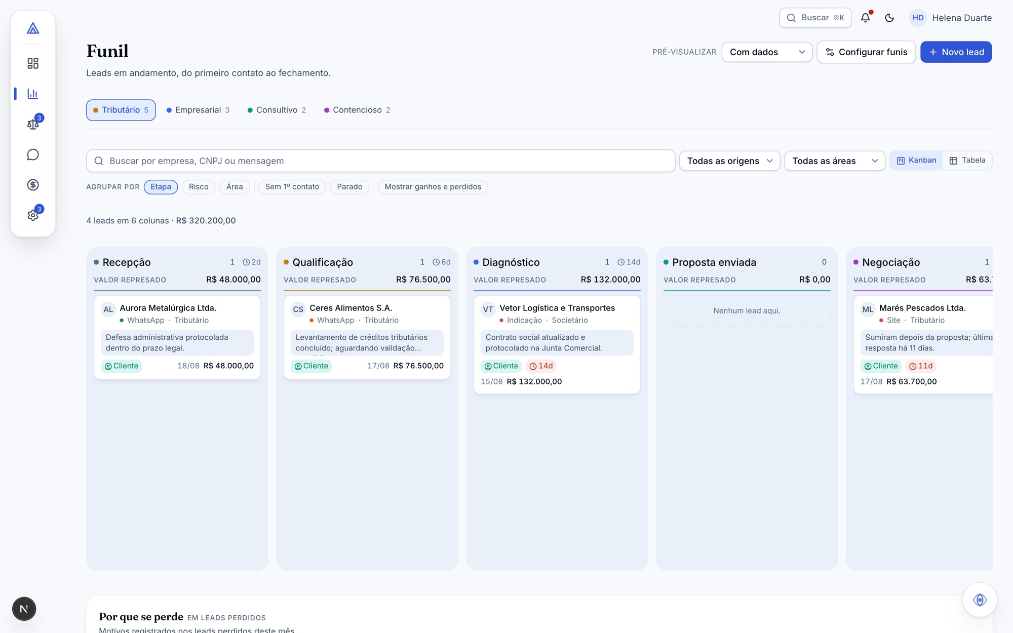
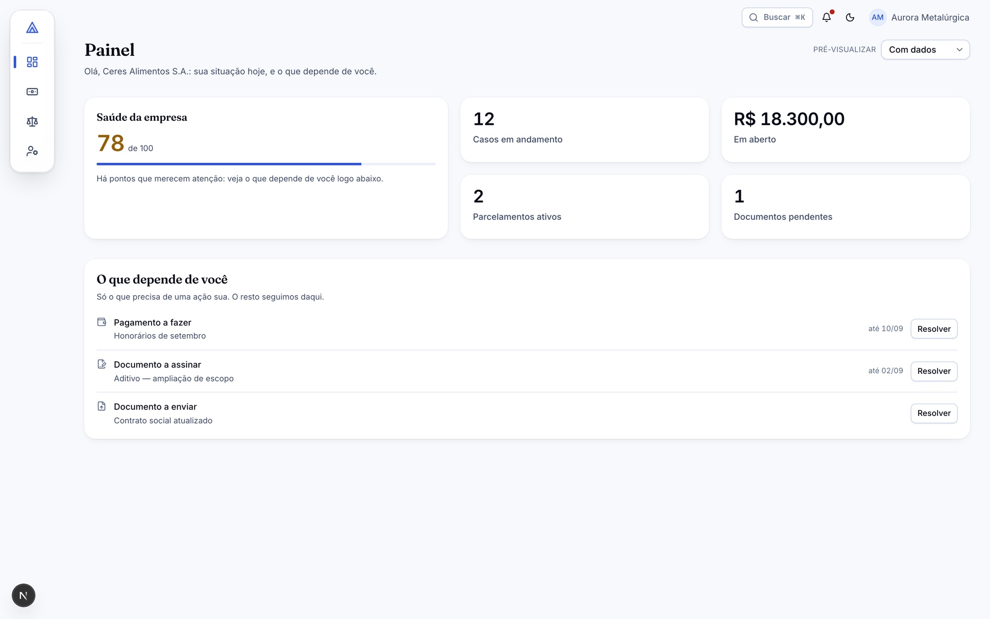
The proposal was not presented as loose screens. It was built as a product you open in the browser and cross end to end.
The design phase closed with 35 built screens and 36 data contracts. Every screen is born with four states — data, loading, empty and error with retry — and the prototype exposes a visible state selector, so any of them can be demonstrated in a meeting without simulating a failure. Every string goes through the translation layer, in Portuguese and English, in the same commit.
The boundary between design and engineering is physical, not agreed: no screen makes a request, reads an environment variable or calls a server action — all integration lives in a separate layer, and a checker in CI fails the pull request if the rule is broken. It is what lets an approved screen become an integrated screen in hours instead of becoming rework.
06 · Intelligence with an owner
Who presses send?
The product's entire AI model fits into that question. The answer is a product design, not a model feature: risk decides whether the agent acts alone or whether a human step is mandatory.
Risk decides the path
Zero risk sends on its own. Risk one, two or three goes to the approval queue without exception, where a person approves or declines. The interface never sends without a human step above zero risk.
Stopping is information, not failure
A zero-risk agent can stop on its own when the error would be irreversible — for example, on identifying a fatal deadline. When that happens, the screen shows the reason for the stop instead of burying it in a log.
A draft is not a message
What the agent produces lives in the queue, never in the conversation. Only after human approval does it become a sent message, and it carries the mark of what generated it. Mixing the two would let a client read as sent something nobody checked.
The cycle leaves administration
The highest commercial impact at the lowest cost in the whole diagnosis: take the approval queue out of the maintenance area and design it as a central product screen. What was already built became what the lawyer sees.
07 · Highlights
What consolidation freed up.
Shrinking the surface was not cutting features. It was gathering what already existed scattered and returning each capability to a single address.
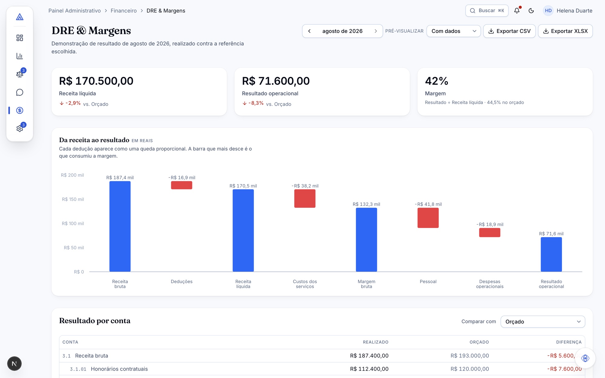
Finance in seven screens
The 20 screens became 7, with coherent tabs and the registries out of the main menu. The practical rule that organised the area: at most two levels inside one screen — the third layer of tabs simply vanished from view.
One calculation with accounting consequences
The risk grading of cases decides what enters the firm's result and what stays out of it. "Possible" is not half-probable: there is no such thing as provisioning half, and an in-between number would invent a grade the standard does not have. The interface reflects the three grades, with no middle ground.
Fatal deadlines in colour and in text
Irreversible once missed, so never signalled by colour alone — someone who cannot tell the colours apart needs the same information. And a fatal deadline without a date does not exist: if it arrives that way from the source, it is a defect, and the data contract refuses it.
Support in full screen
Talking to a client is not consulting a panel: at that moment it is the entire job. Support became a workspace, with navigation stepping out of the way — and went from three competing interfaces to one.
Two areas, one door
The firm panel and the client portal share an entrance, and the area is resolved after verification — whoever knows which area an email belongs to is the registry, not the person at the door.
Scaffolding that looks like scaffolding
The login's demo shortcuts have a dashed outline, a sunken surface and a "Prototype" badge. Scaffolding that looks like the product is scaffolding someone mistakes for product — and that is how it stays forever.
08 · Impact and learnings
What the prototype makes testable.
No number here is a production result. These are hypotheses the prototype makes verifiable before they cost engineering time.
The first hypothesis is about reach: if the same capability fits into 29 menu items instead of 53, a solo lawyer — who has nobody to train them — can cross the platform alone. That is testable with anyone sitting in front of the prototype, with no back end, and it was untestable while the proposal was a document.
The second is about perceived value: promoting the AI cycle from maintenance area to central screen changes what the product appears to be in the first session. The diagnosis names this the highest commercial impact at the lowest cost — that claim remains a hypothesis from the document, not a measured result.
The most useful learning was about the form of the record. Fourteen decisions written down with their discarded alternative changed the nature of the meetings that followed: instead of reopening the choice, the conversation became what changes if the client prefers the opposite — which is the information whoever implements it actually needs.
09 · Conclusion
Shrinking the surface is product work.
No feature was removed. What changed was how many paths lead to the same place, and how many lead nowhere.
The hard part of this project was not designing the Dock or the Oracle. It was deciding, one by one, the fate of 21 orphan routes, choosing one word per concept, and accepting that consolidating finance was expensive and had to be done anyway. Those decisions do not show up on a screen — they show up as the absence of confusion.
The prototype delivered what a screen deck does not: the ability to cross both areas, hit the error states, open the approval queue and disagree with the product in front of you. The engineering phase started with the screens already existing, the data contracts already written and the decisions already recorded — which is the only way a proposal survives contact with implementation.