Case · Multi-tenant platform · Loyalty
A point is a
financial asset.
A network with 390,000 registered customers ran its loyalty programme on a system it wanted to retire. The prototype designs its replacement: multi-tenant, white-label, and built on a points ledger that is never edited — only corrected.
01 · Context
The production system was the starting point — not the destination.
There was a programme running, with real numbers and real rules. What there was not was a platform the client wanted to show anyone.
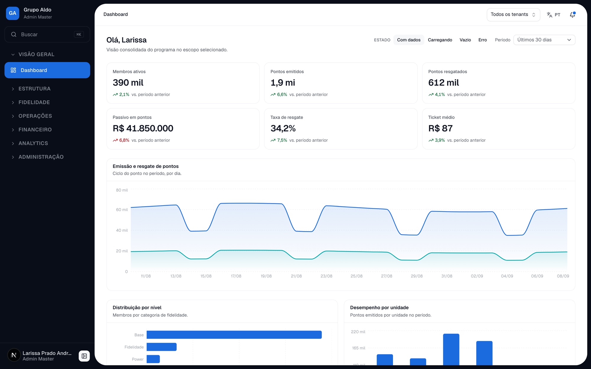
Club Petro is the points system Grupo Aldo uses today: six areas, around 45 screens, 390,168 customers registered across the REDE ALDO network and spread over five tiers. It was surveyed from the production screens, not from assumption — and it established what the new product has to be able to do. The client rejects the form: a horizontal menu, dense filter panels, nine-column tables with 16-pixel action icons, and a marketing banner on the home dashboard.
The criterion was explicit from the start: feature parity is mandatory, visual parity is not. The legacy system is a reference for flow and for data, never for form. In parallel, the client's architecture vision described a far larger product than the current system — a single core serving N clients, with brand, theme, domain and language as per-tenant configuration, never as code.
02 · Challenge
Three sources, and none of them fully agreed with the others.
The project began with an information-architecture mind map, a solution-architecture deck and the survey of the production system. Each described the same product, and the three diverged on points that changed how the screens had to be designed.
Entities with no place in navigation
Companies, units, products and categories appeared in the mind map's data hierarchy but not in its navigation. The legacy system genuinely has them — so they exist, and they needed an address.
"Campaigns" appeared three times
Under Campaigns, under Communication and under Analytics. The question was not where to put it: it was whether these were three entities or one entity with three views — and the answer changes the data model.
Conflicting vocabulary
The map used Members in navigation and Consumers in the hierarchy; the legacy system said Customer. And "customer" is ambiguous in this product: it can mean the end consumer or the company that licenses the platform.
Thirteen reports, four destinations
Analytics had four items; the legacy system had thirteen reports. Six of them had no obvious destination — and inventing a place for them would have been worse than recording the question.
Features with no business rules
Missions, refer-a-friend, automation and communication templates do not exist in the legacy system and were not detailed in the deck. Building them properly would require research that did not yet exist.
Scope could not be decoration
Isolation between tenants is the product, according to the client's own material. That means the scope selector in the header is not a convenience filter: it reflects a segregation that exists at the data's origin.
03 · Strategy and mapping
No divergence resolved in silence.
Cross-reading the three sources produced a list of gaps and conflicts. Every item became a recorded decision — or an explicitly open question.
The gaps-and-conflicts document is the project's backbone. Every information-architecture choice appears there with the alternative that was discarded and the reason. More importantly: each decision records what changes if the client prefers the opposite — because that is the information whoever implements it needs, not the isolated verdict.
Where no rule existed anywhere, the choice was the most conservative one and it was marked as such. The prototype's password, for instance, validates only that a value was entered: no minimum length, no uppercase or symbol requirement. Inventing a password policy would have created a requirement nobody asked for, which someone would then implement as if it were a product decision. Where a decision had a consequence in the code, it was implemented the same day — it did not stay merely written.
04 · Design decisions
The data model decides the shape of the screen.
The most consequential choices in this project were not visual. They were the ones that translated an architectural premise into interface behaviour — and the ones that refused the obvious pattern because it contradicted the model.
- 01
An immutable ledger, so transactions are not edited
The points ledger is immutable and double-entry. The direct consequence on screen: there is no form to edit an entry. Mistakes are corrected by reversal, which is a new entry with its counterpart. An "edit" button there would contradict the data model and produce a balance the ledger does not recognise.
- 02
Rules are not CRUD
The rules engine is declarative and versioned, with sandbox simulation before publishing. The rules screen therefore needs a preview and a version history — not the list-with-a-create-button that any registry would ask for. Publishing an earning rule without simulating it is publishing a calculation nobody has seen run.
- 03
One entity, three views
A campaign is one thing seen from three angles: management (rule, audience, period), delivery (message, channel, template) and outcome (performance). Treating them as three entities would have duplicated the record and created the chance of divergence. If the client wants them separate, the record states exactly what has to change.
- 04
The act and the voucher are different things
A redemption is the act; a voucher is the life cycle of the proof — issued, used, cancelled, expired — including manual clearing at the counter. The legacy system treated vouchers as a whole module, and merging the two would have erased an operational flow that happens every day.
- 05
Approvals is a queue, not a form
Manual entries go into Adjustments, but approvals got a route of their own: it is a queue with authority limits by point range, with mandatory reason and evidence and an audit trail. Queues and forms have opposite rhythms of use, and mixing them penalises the more frequent one.
- 06
One term, one meaning
Members in the interface, member in the code, recorded in a glossary. "Customer" was retired for ambiguity. It is the cheapest correction in a product with three sources of vocabulary, and the one that pays most: every duplicated word becomes one question per session.
- 07
Two doors, not one
The email-and-password form is the product's sign-in screen. Entry by demo profile is a separate route, because the prototype's value lies in showing the platform through each profile's eyes. Merging them would fill the login with scaffolding — and the scaffolding leaves together with real authentication, in one go.
- 08
Personal preference is not permission
Dark theme, high contrast, font scale and reduced motion are per user and survive navigation, but they do not alter the access profile. An operator remains an operator with a dark theme and 125% font — it sounds obvious, and it is exactly the kind of thing no product verifies until someone complains.
05 · The life of a point
From the pump to the redemption, in six steps.
The whole product exists to operate one cycle. Understanding that cycle is what made it possible to decide what each screen has to show — and what it has no right to do.
- 01
Transaction at the source
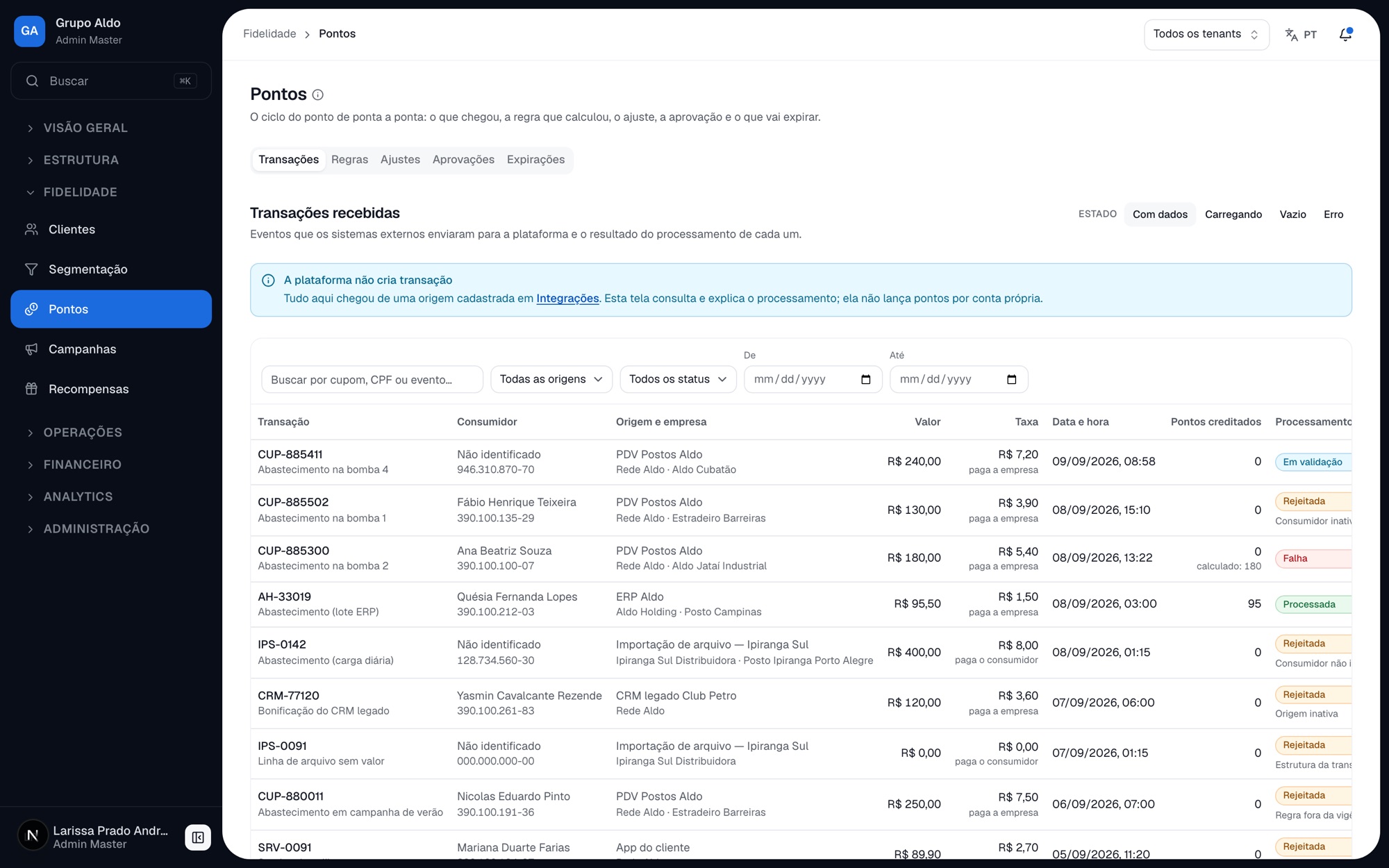
A sale happens at the point of sale, in the app or on the portal of any unit in the network. The platform does not create transactions: it receives them from registered sources.
- 02
Business event
The transaction becomes an event, decoupled from the sale. That is what lets the same rule serve different sources without the calculation depending on whichever system made the sale.
- 03
The rules engine calculates
Points by profile, product, campaign and issuing company. The transactions screen shows which rule was applied and the calculation line by line — because "why did I get 95 points" is the question support receives most.
- 04
The ledger credits in double entry
The customer's balance on one side, the issuing company's liability on the other. That is where the points-liability indicator comes from, and it is the number the network's finance team actually tracks.
- 05
Redemption across the network
At the tenant's own unit or at an accredited partner — pharmacy, clinic, laundry. Partners enter through a light accreditation portal and widen the perceived value of a point without touching the core.
- 06
Settlement and audit
Reconciliation between units and transfer to partners, with cycles of traceable composition, approval by authority limit and handling of discrepancies. A point is a financial asset: the end of the cycle is accounting, not visual.
06 · Permissions
The matrix governs the menu, not the other way round.
In almost every admin panel the menu is a fixed list and permissions merely disable buttons. Here the relationship is inverted — and that changed what the prototype is able to demonstrate.
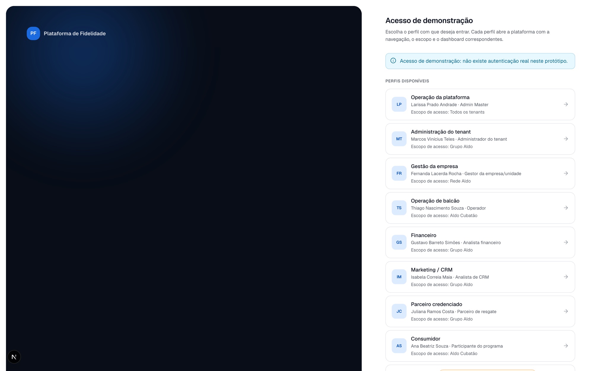
Eight profiles, eight different products
Master admin, tenant admin, company or unit manager, operator, finance, marketing, partner and consumer. Someone signing in as a counter operator sees 9 menu items; the master admin sees all 40. It is not the same screen with fewer buttons: it is a different platform.
Changing the permission changes the interface
The matrix crosses resource, action, scope and authority limit. Editing it on the access-profiles screen changes what that profile sees — in the menu and in the screens. It is the kind of behaviour that normally only appears after integration, and here it is demonstrable in a meeting.
Scope at three levels
Tenant, company and unit. Scope follows the user through navigation and global filters survive context switches — because losing a filter when you change tab is how the legacy system taught people not to trust the screen.
An append-only audit trail
The trail only adds, and linked users and profile comparison live on the same screen. Whoever grants access needs to see what that access permits before granting it — not after someone uses it.
07 · From strategy to experience
Forty menu items, none of them planned.
Every menu item opens a screen that exists. None is a promise, a sketch, or a path that ends blank.
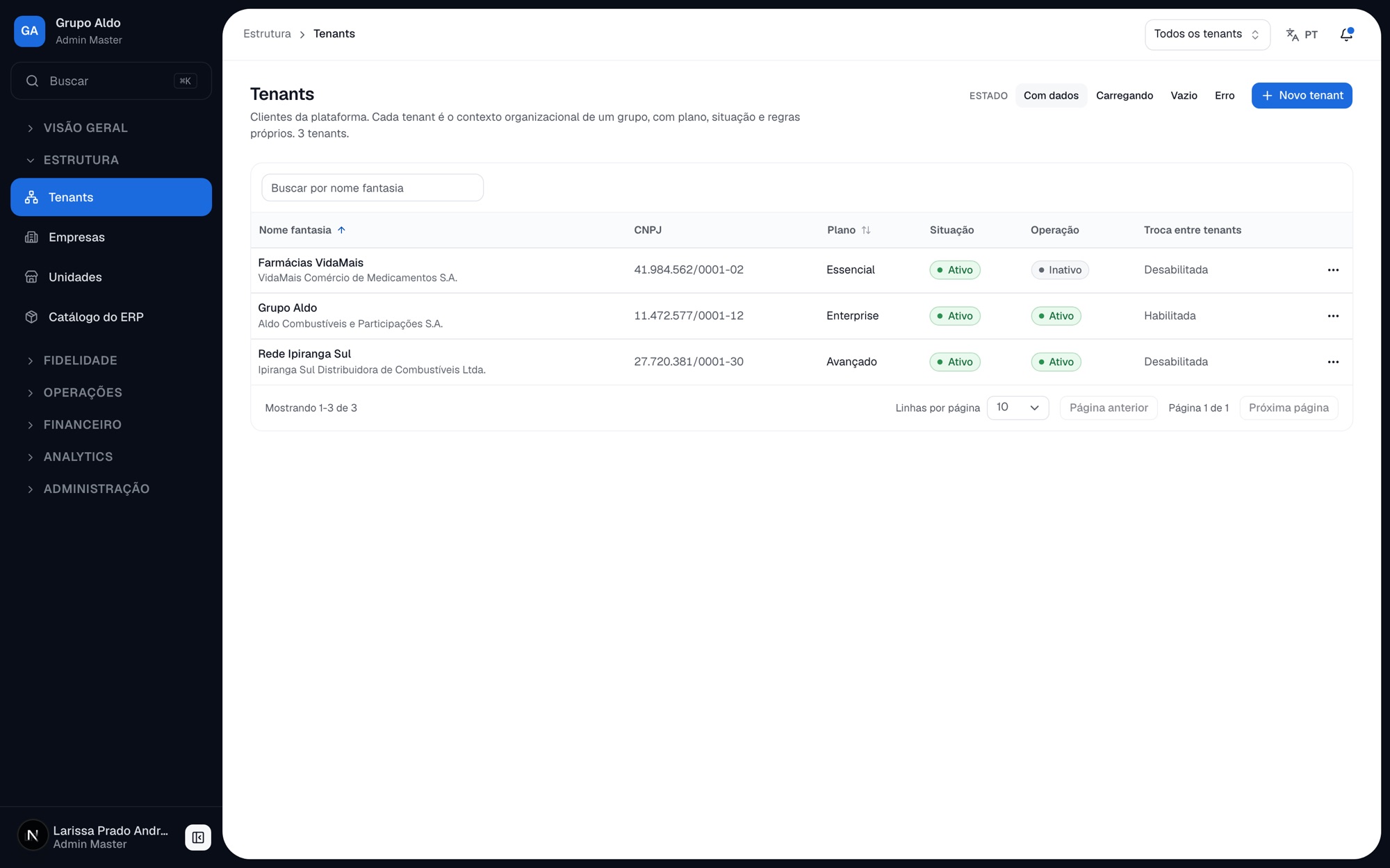
On any finished screen you can create, edit and delete records, filter, search, sort and paginate — and see how the product behaves while loading, when empty and on error, because the four states are a condition for a screen to count as finished. Empty still distinguishes "no records" from "no results for this filter", which are different situations calling for different actions. The data is fictional, but anchored in the rules of the system the network uses today.
Every registration form has "fill with an example": one click fills the whole form with valid data — in the tenant onboarding wizard, all six steps at once. It looks like convenience and it is a presentation decision: nobody types a company registration number in a meeting, and the real alternative was the demo stalling on the form instead of reaching the screen that mattered.
08 · Highlights
What makes this more than a large CRUD.
Almost every module here could have become a registry with a list and a form. The ones that did not are the ones carrying the product's intelligence.
The visual catalogue as a contract
The rule is short: if it is not in the catalogue, it should not appear on a screen. If something is missing, it enters the catalogue together with the first screen that needs it — not later, when three variations already exist.
Brand as configuration
The primary colour derives from variables, not from a fixed colour inside a component. Switching a tenant's brand preset requires changing no screen — and if it does, that is the sign of a raw colour somewhere, which is exactly what the catalogue exposes.
Tiers are configuration, not segments
A tier carries point validity and an approval policy, belongs to a company and has a display order. A CRM segment is a different thing. Treating them as synonyms in the legacy system is what made point validity look global when it is per tier.
Simulate before it counts
Rules, tiers and segmentation all have simulation and reprocessing with a preview. In a product where the calculation becomes a financial liability, publishing without seeing the result is the most expensive operation the interface can allow.
Settlement with an open calculation
Cycles with traceable composition, approval by authority limit, transfer and reconciliation of discrepancies. A partner has to check the figure before accepting it — and a total without its composition is a figure that generates a dispute.
Analytics by objective, not by table
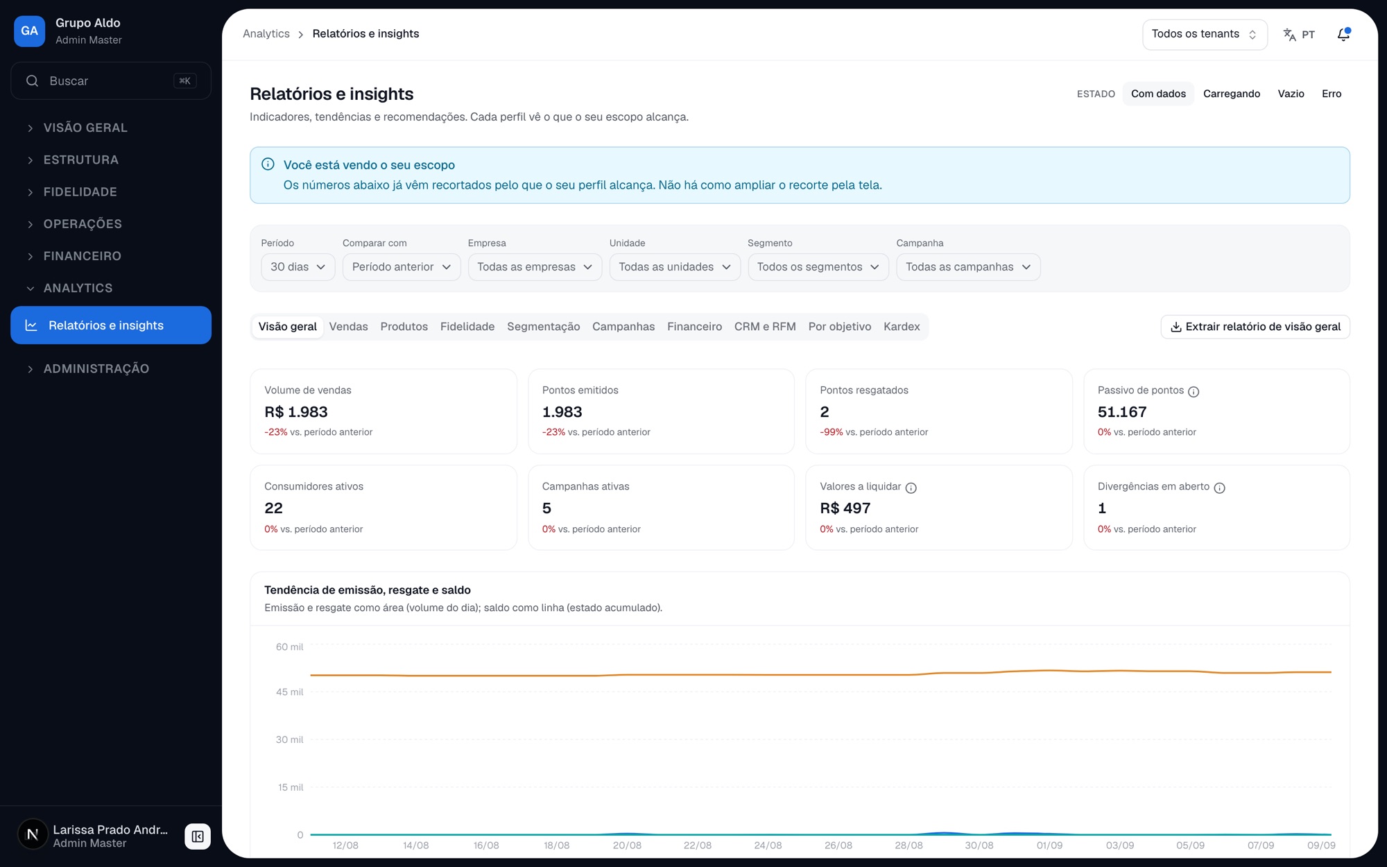
Dashboards per profile in tabs, an interactive recency-frequency-value matrix, and alerts that arrive with a recommendation. A report that suggests no action is a report nobody opens twice.
09 · Impact and learnings
The value of a prototype you can operate.
The milestone of this phase, in the client's own roadmap terms, is "prototype approved". The goal was not a beautiful screen: it was an informed decision.
The central hypothesis this prototype makes explorable is one of representability: can a multi-tenant product with eight profiles, three scope levels and an immutable data model be understood by the person approving the investment, before the back end exists? The answer does not come from a presentation — it comes from someone signing in as an operator, not finding what the admin finds, and realising that this is the design and not a defect.
The physical boundary between design and engineering is what made that sustainable. No screen makes a request; the integration libraries are not even installed; a checker scans the code and fails the pull request if they appear. It is not bureaucracy: it is what makes a screen integrable in hours instead of rework — and it is what let the two teams work in parallel without colliding.
What remained open is written as open. Six legacy reports still have no destination in Analytics, the card-range rule is not documented even in the current system, and four new features entered only as navigable routes because building them properly requires research of their own. A prototype that pretends to have answered everything hands engineering a debt nobody knows about.
10 · Conclusion
Architecture before interface.
In a product where a point is a financial asset, the most important design decisions happen before any screen exists.
This project was, above all, an exercise in translating architectural premises into interface behaviour. An immutable ledger becomes the absence of an edit button. A rules engine with a sandbox becomes mandatory simulation before publishing. Isolation between tenants becomes a scope selector that is not decoration. None of that shows up in a layout — but all of it decides whether the platform will be integrable or will have to be redesigned in the first back-end sprint.
The prototype does the job this phase asks of it: present and validate the product with the client before the back end exists, with forty menu items that open real screens and eight profiles that see different platforms. What it does not do — and does not pretend to do — is prove a business result. That only comes after the first point is genuinely issued.