Case · Website redesign
Escola Superior
de Redes
Redesign of the ESR/RNP course platform — research, information architecture and a clickable prototype that cut pre-enrolment time by 48%. Scroll to explore the real interface.
01 · Introduction
IT education
that fits the routine.
ESR, the educational arm of RNP, faced usability, performance and aesthetic challenges on its course platform.
As part of the redesign squad, I worked with a multidisciplinary team to serve the needs of students, managers and IT professionals, modernising the experience without losing the brand's technical heritage.
02 · Challenge
What was blocking
the experience.
03 · Goals
Three fronts,
one clear direction.
Performance & accessibility
Optimise ESR's performance and accessibility — perceived speed, contrast, keyboard navigation, screen readers.
Identity & services
Align design and identity with ESR's terms and services — a technical brand that finally recognises itself visually.
Critical flows
Simplify flows like enrolment, course search and class management — fewer clicks, less doubt, more conversion.
04 · Process
Design Thinking,
five stages.
A human-centred, iterative process — empathy, creative problem solving and prototyping, aimed at creating solutions that resonate with users' needs and preferences.
- Research
- Interviews
- Benchmark
- Personas
- User journey
- Empathy map
- Heuristic analysis
- Flow analysis
- Brainstorming
- Wireframes
- Prototyping
- Navigability
- Usability testing
- Heatmap
- Feedback gathering
05 · Personas
Three profiles,
three routines.
“Finding courses became more intuitive and faster.”
06 · Prototype
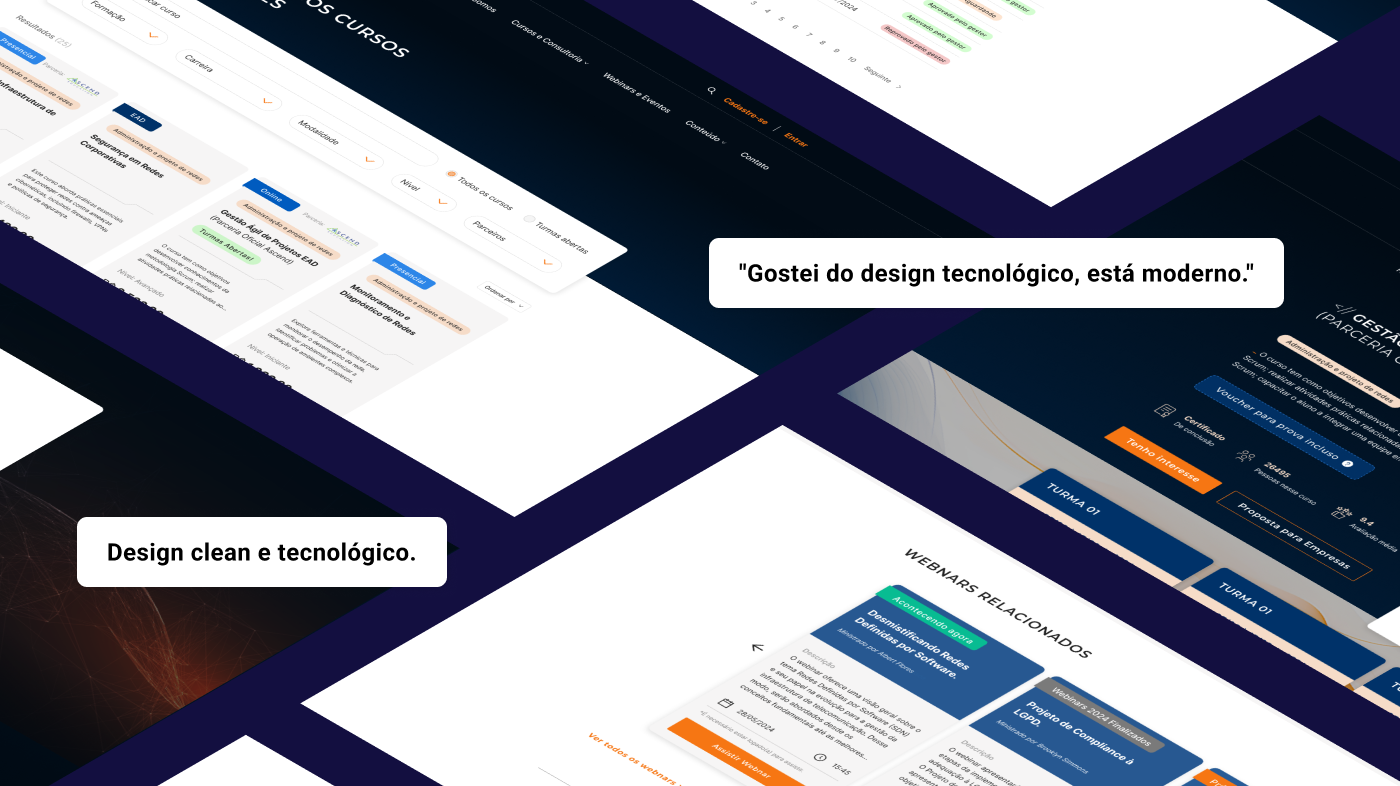
Clean design,
technical feel.
More breathing room, clear visual hierarchy, a simplified enrolment flow — and an identity that finally speaks to IT professionals.
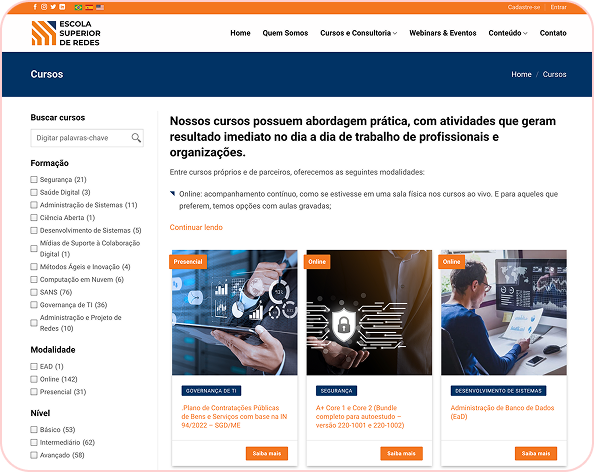
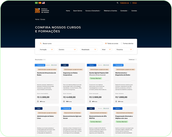
The old catalogue: confusing hierarchy, hidden filters. In the redesign: a navy header with persistent search, filters by track, career and format, and a consistent card grid.
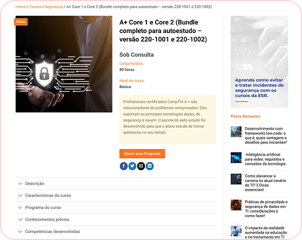
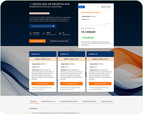
Course page before: scattered information, timid CTA, focus on side content. After: a block of comparable classes, prominent pricing and a single CTA, "Request a proposal".
06.5 · Full page
Home before & after.
The full vertical scroll of the home page — before, dense and fragmented; after, with clear hierarchy, breathable blocks and one CTA per context.
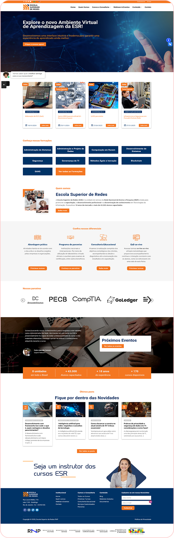
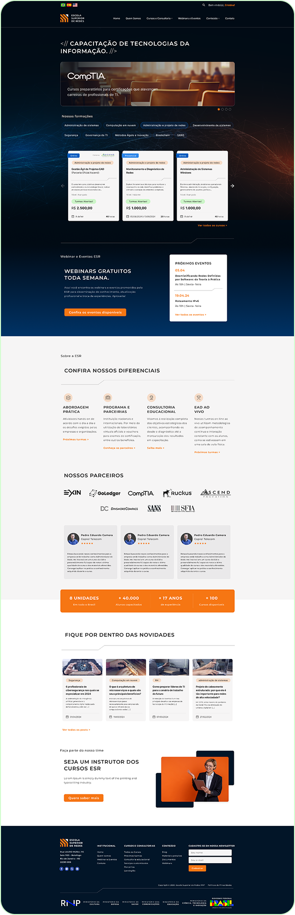
Average pre-enrolment time fell 48%.
07 · Testing
Validation with
real users.
We ran moderated tests with participants representing the three personas, focused on how well the critical flows were understood. 76% of users completed search and pre-enrolment without support. Direct feedback was crucial for the final refinements before delivery.
08 · Results
The numbers
after the redesign.
Pre-enrolment completed unaided
Average flow time (min)
09 · Conclusion
More than a
visual redesign.
Taken together, the ESR website redesign delivered on strategic commitments to transparency, modernity and usability. Simplifying the enrolment flows and refreshing the visual identity set a solid base for future iterations, ensuring ESR not only meets but anticipates expectations in technical education.