Case · Marketplace · Agribusiness
The horse is
on the map.
Rebuilding Cavalar, the marketplace where breeders list and buyers search for horses across Brazil. Feature parity with the live product, an entirely new form — and forty-one recorded architecture decisions, each with the alternative that was refused.
01 · Context
A product that already existed, and had already learned things.
Rebuilding is not starting over. The live system carried rules that had cost time to discover — and mistakes worth not repeating.
Cavalar connects people selling and people searching for horses: a listing with pedigree, awards, verified paperwork, training level and approximate location. The real audience uses a phone, often out in the field, and sharing happens over WhatsApp — a filter pasted into a conversation is one of the product's declared growth engines. On the other side there is a moderation operation: reports, seller verification, bulk listing imports and taxonomies that change the site immediately.
The starting point was a survey of what existed: screens, flows, features by area, and business rules read from the production code. The declared criterion for the rebuild is parity with the original sitemap — which makes every new route a decision that has to be justified rather than a natural addition.
02 · Challenge
Three houses for the same job.
The audit found structural duplication and a systemic flaw no single screen could fix. Both required a product decision before any design.
The same grid on three routes
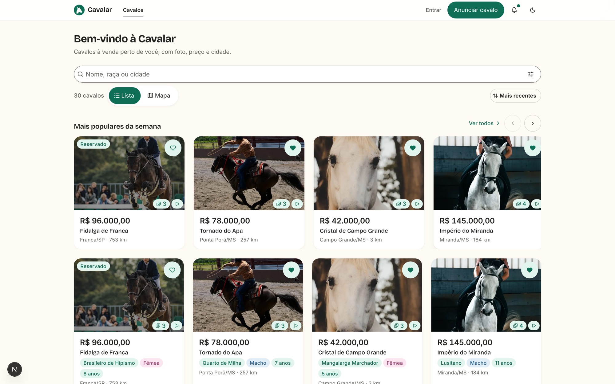
Three routes displayed a listing grid with the same header, the same column grid, the same card and the same four states with the same wording. The only real difference: one of them had filters and a map.
One job, three names
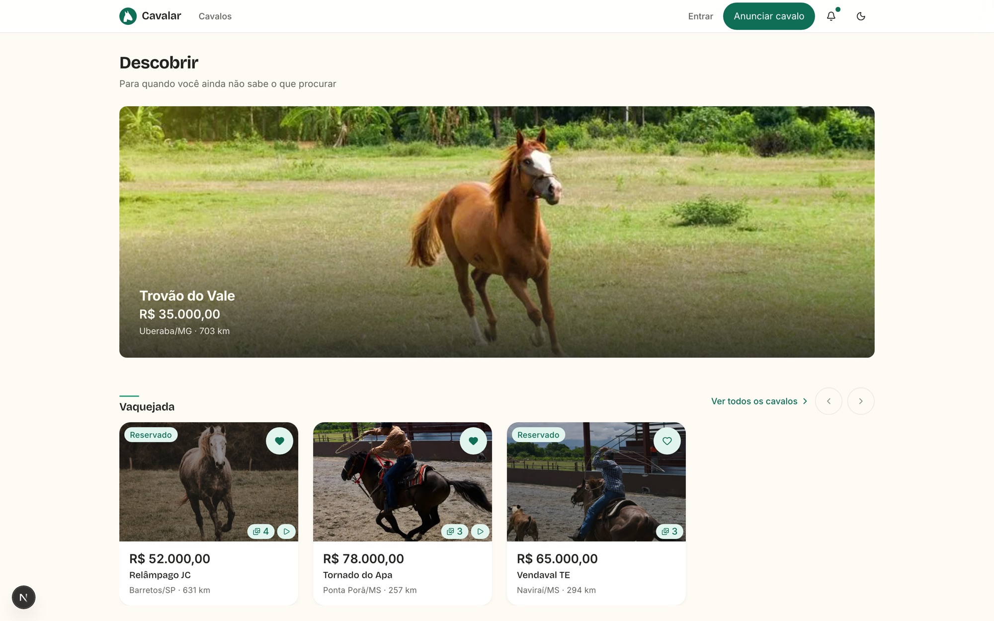
Showcase, catalogue and discover named the same thing in different places, and the screen titles did not help tell them apart. The voice guide found the conflict before the architecture did.
Back led to different places
The error page sent people to one route, the animal's listing to another, and the publishing wizard to both. There was no single home to return to.
No touch target was compliant
The button scale ran from 24 to 36 pixels; fields, 32. The accessibility guideline asks for at least 24, and mobile operating systems ask for 44 and 48. The system could not even express a valid target — so no screen could be right.
The obvious fix was the wrong one
The answer that suggests itself is to fix it by screen width. But the axis is false: the moderator may be on a tablet and the buyer on a large phone. Window width says nothing about who is using it, or what for.
An identity without numbers
The inherited palette had a green that fails contrast for normal text on white and a grey that fails everything on the brand's sand. Without measurement, a colour decision is a preference — and preference does not survive the first review.
03 · Strategy and mapping
Measure before you opine.
The product's visual identity was extracted from the legacy system with every contrast calculated, not estimated — and the calculation came along with it, reproducible.
The brand document transcribes the inherited palette, converts each colour and measures each contrast pair with the canonical formula, publishing the script that produces the numbers alongside. Where the values diverged from the ones quoted in the brief, the divergence was recorded and resolved in favour of the reproducible number — and the practical conclusion did not change: the mid green fails for normal text, and the valid correction for an action surface is the darker green.
The same principle guided the architecture. Every duplication became a numbered finding, every journey friction became an item, and decisions were only taken after measuring the reach. The touch-target fix, for example, touches 48 files importing the button and 19 importing the field — every route, without exception. It was the biggest lever for the smallest cost in the whole survey: three files.
04 · Design decisions
Every decision carries what it makes harder.
The format is fixed: what was true that forced the decision, what was decided in one sentence, the discarded alternatives with the reason for each, and the consequences — including the bad ones. An alternative with no recorded reason comes back as a proposal in two weeks.
- 01
Two homes for discovery, not three
The showcase route was removed. The fact that decided it was in none of the earlier documents: it did not exist in the legacy system — it was a route invented during the rebuild. No link shared over WhatsApp pointed to it, because it had never been live. Removing it does not break the declared parity: it restores it.
- 02
Discovery state lives in the URL
Filter, sorting, page and view mode live in the address, read in a single place — no screen reads the URL on its own, because two readers of the same data diverge by the third filter. The cost is recorded and was accepted: the route stops being static. The gain pays for it: a filter pasted into a conversation opens identically on the other side.
- 03
Touch targets have an axis of context
Two named densities, chosen by the shell and not by the screen or the window width. The marketplace uses the comfortable one, with 44 pixels on every control, because the buyer has a phone in hand out in the pasture. The admin uses the compact one, with spacing compensating, because the moderator scans tables.
- 04
Three contact actions with names of their own
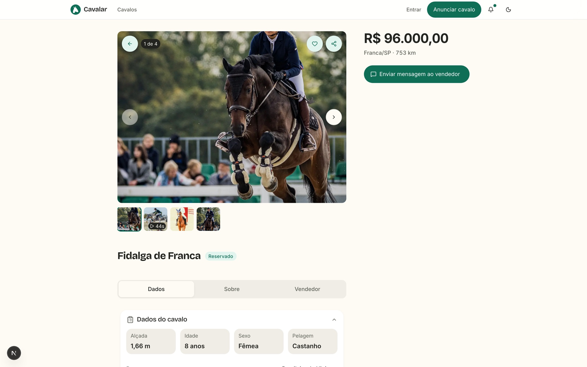
The phrase locked in the brief — "talk to the seller" — described two actions side by side on the same listing, and the legacy system had already created three different keys for them. The name of the action determines how many actions exist: send a message, call, and open WhatsApp each got their own verb and object.
- 05
A number in copy requires a metric
The brief claimed that listings with video and pedigree receive three times more contacts. The repository had swapped that for "sell faster" — and selling is precisely what the platform does not measure, because the sale happens outside the app. The wording stayed without the number, with the right verb: asserting what you do not measure is the same failure as writing "trusted seller".
- 06
Publishing requires a number
"Price on request" is a legitimate state, but it is born in editing, not in publishing. Allowing publication with no price on a marketplace whose main filter is price range produces a listing that appears in no search — and the seller has no way of knowing.
- 07
Logged out is not the fifth state
Sign-in is a gate on action, not on reading. Someone arriving from a shared link sees the listing; the door appears when they try to save, message or list. Treating "no account" as a screen state beside loading, empty and error would have put a wall in front of the content that attracts people.
- 08
Five decisions stayed with the client
The home's default view, the sign-in method, the map's night mode, the meaning of a zero price and saving without an account are direct conflicts between the brief and the product as built. They are recorded as blocked, with both readings and the consequence of each. Deciding alone there would have meant deciding in place of whoever has the information.
05 · What did not make it
Refusing is a product decision.
A good share of this work's value is in what was left out, and in the recorded reason — because that is what stops the same proposal from returning in a month.
The number you cannot stand behind
"Three times more contacts" is a quantified claim in a product at the start of its life, whose declared problem number one is listing density. It is not a lie: it is that there is nowhere to get the number yet. When there is measurement, the sentence comes back with it.
Never the exact address
The map shows the municipality and a privacy circle around the selected listing. The coordinate for a bulk-imported listing is always the municipality's centre. Greater precision would be more useful for buying — and also for stealing.
Languages that do not exist yet
The legacy infrastructure supported three languages, but only Portuguese was complete: the other two had twelve lines of translation against four hundred. The redesign does not assume they work — Portuguese is the published language, and English is kept at parity verified in CI.
A promise of trust
No "one hundred per cent safe purchase" or "trusted seller". A badge only appears where the platform actually verifies something — paperwork checked, seller verified. Trust asserted without verification is the first thing a buyer tests and the first thing they lose.
06 · From strategy to experience
The whole product is crossed in the browser.
No loose screens and no imagined flows: the listing publishes, the filter applies, the map clusters and the conversation opens.
The screens were built in code consuming fictional data contracts, with the four mandatory states and every string going through the translation layer. The boundary with engineering is verified by script: no screen makes a request, reads an environment variable or calls a server action, and CI fails the pull request if one appears.
The practical gain is in the conversation. Debating whether map mode should be the home's default is one thing when looking at a layout, and something else entirely when the person drags the map, watches the clusters regroup and notices how long it takes to find an animal in their own region. The decision on that default is still recorded as pending with the client — but now it is taken with the product in front of them.
07 · Highlights
The pieces that hold discovery up.
Four areas concentrate almost all of the product's complexity: finding, evaluating, listing and moderating.
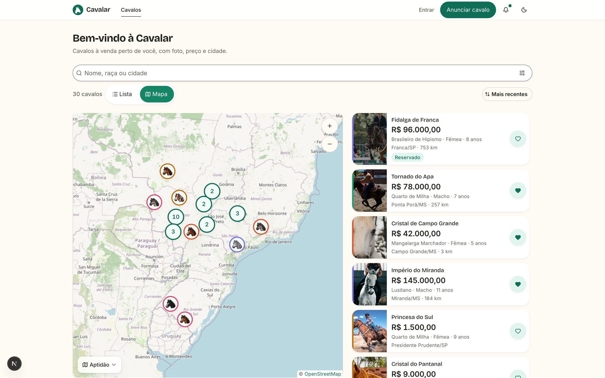
A map that respects privacy
Clustered pins that regroup by zoom level, a pin for the viewer's position and a privacy circle around the selected listing. The pin's colour communicates the animal's coat — information buyers look for before they even open the listing.
Filters worthy of the domain
Aptitude, discipline, deal type, price, age, awards, breed, sex, height, coat, training level, paperwork in order and sale conditions. A breeder's vocabulary, not a generic catalogue's — and every value comes from the taxonomy, never from free text.
Publish in four steps, complete later
Photos, price and municipality publish the listing. The full record comes afterwards, in optional collapsible blocks, each showing how many fields are filled. Demanding the full record at publication is the most reliable way to end up with no listings at all.
One fixed bar per screen
Where the action comes in, navigation steps out. On a phone, two anchored bars compete for the same thumb and the same 44-pixel band — and the one that loses is always the one the user wanted.
Governed taxonomy
Aptitudes, disciplines, breeds, coats and deal types are administrable, and changes reflect on the site immediately. An item in use by any listing cannot be deleted, only deactivated — deleting would rewrite listings that do not belong to the administrator.
Imports you can undo
Batches of listings arrive by spreadsheet, checked line by line against the official lists, tolerant of accents and capitalisation. An error blocks the line, a warning does not. And the whole batch can be undone — an import with no way back is the operation nobody dares to use.
08 · Impact and learnings
What becomes testable.
No production metric is claimed here. What the prototype delivers is the ability to answer questions that previously could only be answered after launch.
The most important hypothesis is about sharing: if the entire discovery state lives in the address, a filter pasted into a conversation opens identically on the other side. That is verifiable today, by copying the URL between two browsers — and it was the growth bet declared in the brief that had never been built. The second is about touch targets: with two named densities, you can put the product in a real hand and measure mis-taps without waiting for the first app-store complaint.
The learning I take away is about the cost of not recording. The five blocked decisions are all conflicts between what the brief asked for and what the built product does — map night mode, sign-in method, the home's default. None of them is hard to decide; all of them are expensive to rediscover. Recording them as pending, with both readings side by side, turned five circular discussions into five concrete questions.
09 · Conclusion
Parity is not a copy.
The criterion was to keep everything the product knew how to do. The work was discovering how much of that was scattered, duplicated, or under the wrong name.
Rebuilding a product that already works is harder than starting from zero, because every odd thing in the old system might be debt or might be a lesson — and confusing the two is costly in both directions. Removing the showcase route was only possible after confirming it had never been live; keeping three distinct contact actions only made sense after seeing that the legacy system had already created three keys for them, against what the brief locked in.
What the prototype delivers is not an approved layout: it is a product you can cross, with the decisions written alongside and the open questions named. Whoever implements it receives the screens, the data contracts, the reason for every choice and the exact list of what still depends on the client — which is the difference between delivering a proposal and delivering a project.